This is our final trailer. Overall we believe it is sucessful as it can easily be identified as a horror trailer and the views we are gaining on youtube are telling us that people are enjoying viewing it.
Wednesday, January 5, 2011
Final film poster.
This is my final film poster, after recieveing audience feedback I believe I have followed real life media conventions very well to create a product that fits in to the horror genre.


Final film magazine.
This is my final film magazine, after comparing this to other real life media magazines it is clear that we have followed the conventions of a real life media magazine and created something that fits in with our other products amongst our promotional distrubution package.


The editing process of the film poster
In order to edit our film poster we used a software called Photoshop. To begin with we started by using an ordinary photograph of Jodies eye.
We then begun to edit the photograph to create a shattered glass effect as we wanted the eye to seem scary in order to fit our genre. Firstly we changed the photograph black and white using the contrast and brightness tools.
We did this as we felt black and white would suit our genre better. Then we used the cutter tool to cut out sections and move them slightly to create a shattered glass effect.
However when we stretched the edited picture of the eye on an A4 piece of paper it looked very distorted and unproffesional. We felt it had to fit an A4 size piece of paper as this is a major convention of a film poster. Although we knew the image didn't work we still added on the texts including the tagline, headline and realease date to see what the finished product would look like.
After showing this to people as a first draft we wasn't pleased with the feedback, therefore we decided to start the film poster again. We took another picture of an eye on a higher megapixel camera. After importing the eye to Adobe photoshop we changed the whole image in to black and white again using the same brightness and contrast tools and cropped the majority of the eyebrow out using the crop tool.

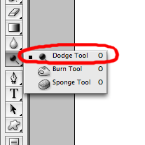
After we created our background, we used the circle cut out tool to cut out a section of our photgraph in a circular shape to place in the centre of the eye. We then put the layer with the photograph of the girls over the top of the layer with the eye, we then changed the opacity of the photograph so you could still see the iris of the eye through it. We did this to symbolise the girls were being watched and to create curiosity. After making sure both the image were in the right place we used the eraser and dodge tool to smoothe out the edges.


We then begun to edit the photograph to create a shattered glass effect as we wanted the eye to seem scary in order to fit our genre. Firstly we changed the photograph black and white using the contrast and brightness tools.

We did this as we felt black and white would suit our genre better. Then we used the cutter tool to cut out sections and move them slightly to create a shattered glass effect.

However when we stretched the edited picture of the eye on an A4 piece of paper it looked very distorted and unproffesional. We felt it had to fit an A4 size piece of
 paper as this is a major convention of a film poster. Although we knew the image didn't work we still added on the texts including the tagline, headline and realease date to see what the finished product would look like.
After showing this to people as a first draft we wasn't pleased with the feedback, therefore we decided to start the film poster again. We took another picture of an eye on a higher megapixel camera. After importing the eye to Adobe photoshop we changed the whole image in to black and white again using the same brightness and contrast tools and cropped the majority of the eyebrow out using the crop tool.

After we created our background, we used the circle cut out tool to cut out a section of our photgraph in a circular shape to place in the centre of the eye. We then put the layer with the photograph of the girls over the top of the layer with the eye, we then changed the opacity of the photograph so you could still see the iris of the eye through it. We did this to symbolise the girls were being watched and to create curiosity. After making sure both the image were in the right place we used the eraser and dodge tool to smoothe out the edges.

When the background and the main image was done, we added on some text where we thought it should be placed to get a rough idea of how our final product would look.

Finally we added on the font we wanted to use, which was Bison and changed it to red using the paint bucket tool to fill the text. 
We changed it to red so that it would match all our othe media products as they are a promotion pack therefore we stuck to our colour scheme to convey this. We also added credits at the bottom using the text tool.
The credits included all of the casts real names, the directors and the people who were encharge of the mis-en scene. We tryed to make it as believable as possible and as close as professional as we could.
Initial film poster ideas.
In order to create a film poster, we needed to decide on which layout we wanted to use. Here are a few I designed:


Analysis of film poster.

This film poster can been seen as unconventional as it has two main images The colours used in this film poster are a dark eerie colour which help to create a sinister feeling within the viewer and also shows the genre of horror clearly.
The main image is off the characters faces; the expression on their faces along with the image of someone being operated on and their faces partly covered by blackness suggests that something sinister is going on within this movie causing the viewer to want to see it.
This poster shows big images of two of the main characters but shows the names of the three main characters at the top. This backs up the fact that something very wrong is happening to one of the characters.
The name of the movie is shown glowing in a blue alien type way which also shows that something sinister is happening and stand outs to the viewers amongst the dark background.
The poster is conventional in the sense that it has the names of other actors and directors at the bottom as well as coming soon and the movie website. However, this poster breaks conventions as it contains a longer and smaller than usual slogan. It’s so long that it could be called a vague synopsis more than a slogan. Film posters are made to be seen at one glance; however, you would need a couple of seconds to read it. If read, it will help to draw the viewer into the plot causing them to want to see what happens.
Analysis of film poster.

This poster caught my eye as it is simple but effective. It uses very few colours, however the technical codes of the poster are that the lighting is very dark around the eye and it gets lighter when you reach the names towards the bottom of the poster. This shows that the person is very dark on the inside whilst on the outside she/he is scared. It also enables to be able to read the writing easily. The camera shot is directly on one eye so it automatically makes you focus on this. The focus is very clear on the eye as it dominates the page. There is a bright white light surrounding the dark eye which could symbolise something is trying to get through and is stuck behind the eye, which is highlighted by the fingers coming out. The colour surrounding the eye seems to give the picture a gloomy feel to it as it is so dark, which is conventional of a horror poster.
The purpose of the text is to inform the reader of what genre the film is and give you a small insight in to it but keep you guessing too. Therefore I like this poster as you aren’t given many clues about the film therefore it leaves you intrigued and you really want to watch it.
The genre of the film poster is a horror, this is made clear because the colours are very dark, shadowed and give you the feeling of the unknown. The image of the eye itself looks startled and scared, which also raises questions in the readers mind as we wonder whose eye it is and why they are scared. The eye is in darkness therefore it could symbolise someone is trapped in the eye and the hand looks as if someone is after her or someone is trying to escape the eye.
Finally the font used here are sans serif, this gives the poster a modern feel. There is bold lettering on the EYE, this shows what the movie is about and what the main idea is, which interlinks with the picture.
Finally Jessica Alba’s name is used at the top of the words the eye, but it is also in colour in red lettering the only colour on the text, so you can tell that she is the one who is going to be the most important person. Also by using a well known celebrity name it will make the audience want to watch the film more.
Analysis of film poster.

This poster is particularly fascinating as it is very unusual. The colour theme is dark and mysterious like most horror movies. The colour scheme relates to the main image on the page as the partial narrative displayed on the poster is very mysterious. As there is a head (half skull) and shattered glass. The half skull and half skin of the head shows that the person is dying as skin represents life and skulls represent death and the glass shattering enforces the destruction and death theme.
The font on the film poster is very plain and it all tends to be in white except for the exception of ‘coming soon’ which is in red so the audience know to eagerly anticipate it. The poster features the website at the bottom of the page, tagline “Rest in pieces” this interlinks with the image as the image is shattered in to pieces, and it’s also a mockery of the saying rest in peace when someone passes away. The title of the film seems to be glowing to get the viewers attention and stay in their mind.
Also it features information about the film being available to see in 3D, with a special tagline “Death saved the best for 3D”, this will attract more of an audience as 3D is a newish technology out in cinemas and people enjoy watching things in 3D at the cinema as not everything’s available to watch in 3D at the moment, therefore it is a unique selling point.
Although this poster has a great look I noticed they do not have the names of any actors, actresses or directors on the film poster. However this is because the “Final Destination” films feature new un-established actors in their films, which could be seen as very unconventional of films in general as normally they have at least one actor/ actress you recognise.
The editing process of the film magazine
In order for us to create a film magazine we needed to get a picture we was all happy to use as the main image, therefore we shot several different photos and decided to use the one with the five victims as we felt it was a good image for a front cover of a magazine. Although this was unconventional we thought it would work well.
After we decided what photograph to use we uploaded it on to Adobe Photoshop and begun to edit it. I begun by turning the picture black and white by darkening the contrast effects to give it a spookier look match our genre. We placed the image where we wanted it and strectched it slightly using the saftey pin to stop the picture distorting. I then selected the same colour as the photo by using the eye drop tool which picks up a sample of the colour where ever you click.

Using the sample colour we selected I used the paint bucket to fill the whole page in the same colour to make it look as though it was one whole page of A4, as conventional all magazine front covers fit an A4 page. I also added a slightly darker grey at the top using the shape tool and selecting a triangle shape so it would made the masthead stand out to our audience and create an interesting contrast of greys amongst our magazine.

I followed this procedure again and made another rectangle but this time smaller and filled it black to add my skyline on to. On top of the black rectangle I used the text tool to add my skyline and changed the colour of the font to white and also made it bold so it would stand out to the reader as white and black are appealing to the eye as they contrast very well.
I then downloaded a font from dafont.com for the title that we all agreed on as we felt it symbolised our horror genre well and filled it black with the paint bucket tool. I then duplicated the layer and filled the duplicate layer red. I then postitioned them both so it looked like the red title has a black 3d effect edge. The colours were symbolic to our genre and the 3d look gave our title depth so it would catch our audience eye.

Underneath my skyline and title I added the issue number, website and date using the text tool and changed the font to Arial and the colour to black to make sure everything fitted our colour scheme. After anaylising other film magazines we noticed they all had pugs on them, therefore we choose to put a conventional pug on our film magazine to attract an audience. Conventionally pugs are meant to look as though there almost stuck on to the page and have a 3D effect to make them stand out. I made my pug by using the shape tool and selecting the elipse option
I then duplicateing the layer and added a glow effect to the duplicate layer, also the duplicate layer was a different coloud so it gave my pug a border which added dimension to it. To complete my pug I added text using the text tool and made sure it filled my filled my pug nicely and there were no noticble gaps. I then added effects to the white writeing with contrasted with the red background it was on to make the writing stand our and also look like it was part of the sticker effect we was trying to achieve.
After placing all the main features on our magazine, we had to add storylines like any conventional magazine, therefore we used the text to add writing. We alternated the colours red and white to make our storylines stand out so one storyline was written in white and the one underneath it was red. We did all the text via the text tool and used the pallete to change the colours and changed the sizes so it didnt look plain and boring. We added small white rectangles in between the storylines to seperate them and make the page look more attractive. We also placed a black rectangle shape via the rectangle shape tool underneath the writing and changed the opacity of the black rectangle so the writing didn't blend in to our background and it could be easily read.

Fianlly we had one last convention to add to our magazine and that was a barode. Therefore I got a barcode of google images and imported it to photoshop and used the arrow to adjust it to make sure it was the size we wanted. I also moved it around via the arrow tool to to see where it would look best and weconventional placed it at the bottom right hand corner along with the price which I added using the text tool.

After we decided what photograph to use we uploaded it on to Adobe Photoshop and begun to edit it. I begun by turning the picture black and white by darkening the contrast effects to give it a spookier look match our genre. We placed the image where we wanted it and strectched it slightly using the saftey pin to stop the picture distorting. I then selected the same colour as the photo by using the eye drop tool which picks up a sample of the colour where ever you click.

Using the sample colour we selected I used the paint bucket to fill the whole page in the same colour to make it look as though it was one whole page of A4, as conventional all magazine front covers fit an A4 page. I also added a slightly darker grey at the top using the shape tool and selecting a triangle shape so it would made the masthead stand out to our audience and create an interesting contrast of greys amongst our magazine.


I followed this procedure again and made another rectangle but this time smaller and filled it black to add my skyline on to. On top of the black rectangle I used the text tool to add my skyline and changed the colour of the font to white and also made it bold so it would stand out to the reader as white and black are appealing to the eye as they contrast very well.

I then downloaded a font from dafont.com for the title that we all agreed on as we felt it symbolised our horror genre well and filled it black with the paint bucket tool. I then duplicated the layer and filled the duplicate layer red. I then postitioned them both so it looked like the red title has a black 3d effect edge. The colours were symbolic to our genre and the 3d look gave our title depth so it would catch our audience eye.


Underneath my skyline and title I added the issue number, website and date using the text tool and changed the font to Arial and the colour to black to make sure everything fitted our colour scheme. After anaylising other film magazines we noticed they all had pugs on them, therefore we choose to put a conventional pug on our film magazine to attract an audience. Conventionally pugs are meant to look as though there almost stuck on to the page and have a 3D effect to make them stand out. I made my pug by using the shape tool and selecting the elipse option

I then duplicateing the layer and added a glow effect to the duplicate layer, also the duplicate layer was a different coloud so it gave my pug a border which added dimension to it. To complete my pug I added text using the text tool and made sure it filled my filled my pug nicely and there were no noticble gaps. I then added effects to the white writeing with contrasted with the red background it was on to make the writing stand our and also look like it was part of the sticker effect we was trying to achieve.

After placing all the main features on our magazine, we had to add storylines like any conventional magazine, therefore we used the text to add writing. We alternated the colours red and white to make our storylines stand out so one storyline was written in white and the one underneath it was red. We did all the text via the text tool and used the pallete to change the colours and changed the sizes so it didnt look plain and boring. We added small white rectangles in between the storylines to seperate them and make the page look more attractive. We also placed a black rectangle shape via the rectangle shape tool underneath the writing and changed the opacity of the black rectangle so the writing didn't blend in to our background and it could be easily read.

Fianlly we had one last convention to add to our magazine and that was a barode. Therefore I got a barcode of google images and imported it to photoshop and used the arrow to adjust it to make sure it was the size we wanted. I also moved it around via the arrow tool to to see where it would look best and weconventional placed it at the bottom right hand corner along with the price which I added using the text tool.


Initial magazine ideas.


In order to create a magazine cover, we had to create several layouts that we could use. Here are a few we created:
Film magazine analysis

MASTHEAD - This is placed near the top of the page to advertise the magazine. It is very unconventional as each letter is a birds-eye view of several buildings to form the shape of each individual letter. This is a very clever and effective way of incorporating the film that is featured into the magazine properly by adapting the logo to the film. The use of these buildings create a mysterious and secretive effect which suggests that this thriller/action film may be based around a mission that takes place in the air. The use of these buildings create a mysterious and secretive effect which suggests that this thriller/action film may be based around a heist, for example, which involves the use of maps.
SKYLINE- The skyline is placed at the top of the page and says 'THE MIND BLOWING ISSUE'. This is very effective as it is all in capital letters and in a bold broad red to catch the reader’s eye. Therefore assuming that this is the first thing the viewer will see, it causes them to want to see what makes it the biggest most mind blowing issue yet therefore they want to read or purchase the magazine.
.
HEADLINE - The headline is advertising the main movie in this case. It is grey and in capital letters across the character's chest which stands out against the black and blue colours.
SUB HEADING - This is placed below the main headline of ‘inception’, it reads 'Inside the ultimate head trip' this implies that the film will be confusing and very psychological which could keep people guessing. It is written in the same font and colour as the headline so the reader links the headline with the sub headline easily as they are both about the film.
PUG - This is in the shape of a circle which is conventional since it is usually a circle. The pug contrast with the background and blends in with the title so it stands out as this is what a pug is meant to do. As it has three different colours on it, it is bold and looks almost like it is coming out of the page.
MAIN IMAGE - The cover features Leonardo DiCaprio which as the main image, it appeals to the audience straight away as he is a recognisable actor. His character is depicted as being quite authoritative as he is wearing a suit and tie which straight away tells the audience he is an important and respected character in the film. His face is half lit by a dim light and he is holding a torch which suggests that the film is quite dark, secretive and perhaps sinister. The colours of this image are mainly blue which give connotations of coldness and sadness, in contrast to the bright red bits of typography that are on the cover which represent heat, blood and anger which implies that this film will be quite chilling and sinister with scenes of fast-paced and thrilling action and perhaps love scenes.
WEBSITE – There is a website that is placed under the masthead, it is written in a very small font but is still noticeable.
DATE - This is placed under the masthead with the issue number, shows when this particular issue was released and also shows that it is a monthly magazine, they are all conventions of film magazines. The writing is similar to the writing used for the website.
PRICE – The price is next to the issue date, which can be seen as unconventional as it is normally somewhere near the barcode.
BARCODE - This conventionally positioned at the bottom left of the page along with the symbol of the publishing company.
COLOURS - The background colour used is a mixture of blue tones, this blends in nicely with the grey writing and makes the red and white writing stand out to the readers.
Film magazine analysis

MASTHEAD - This is placed near the top of the page to advertise the magazine. A bold red colour is used in order to make it stand out in contrast with the white background in order to catch the eye of the viewer since it is a well known magazine.
SKYLINE- The skyline is placed at the top left of the cover and says 'our biggest preview ever'. This is very effective since it is a known fact that the eye reads from top left to bottom right. Therefore, assuming that this is the first thing the viewer will see, it cause them to want to see what makes it the biggest issue ever causing them to read on or purchase the magazine. In addition the word 'biggest' will also catch the customers eye since made to stand out by the use of a different colour than the rest of the words. The skyline also includes 3 different pictures of 3 different games which will also catch the interest of people interested in the gaming industry as well as the film industry which will gain more sales. There are borders placed around the pictures in order to make it more presentable and to keep it from being lost to the other images on the page.
HEADLINE - Instead of using a headline to introduce the main images' movie, they have used a quotation. 'I don't want to be the Jar Jar Binks of a movie'. This creates more interest in the main focus as the reader will want to find out why did Megan Fox say that and what is she exactly referring to.
SUB HEADING - This is placed below the quotation and tells the reader more information about what the quotation is about. This helps the reader to decide if they want to find out more.
PUG - This is in the shape of an arrow which is unconventional since it is usually a circle. The arrow draws the viewers attention more since it is so unusual. Also, the arrow is pointing to the main image which will draw the eye back to the main image.
PLUS - The word 'PLUS' is written in bold red to make it stand out. This causes it to still catch the viewers eyes and draw their attention to the other information available in the magazine which also gains the magazine more sales since it will attract more people.
MAIN IMAGE - The main image is conventionally placed in front of part of the masthead which shows that they believe that the image of Megan Fox will attract customers and viewers more than their own publicity especially since she acts as the main character of the newest movie out. She is also wearing the same outfit which she wears in the movie. As a result, people will recognise who this woman is even if they didn't know her before and again gains the magazine company more revenue.
WEBSITE - This is placed above the name of the magazine in small font in order for customers or fans to find out more about the magazine which gains the company more publicity and PR.
DATE - This is placed unconventionally placed between the skyline and the masthead since it is usually placed right at the top of the magazine. It shows when this particular issue was released and also shows that it is a monthly magazine.
PRICE - This is unconventionally placed right next to the date between the skyline and the masthead. From looking at other magazines I can see that it is usually placed in the barcode.
BARCODE - This conventionally positioned at the bottom left of the page along with the symbol of the publishing company.
COLOURS - The background colour used is very suttle allowing for the main image and words to stand out. The colours of the words which are blue and red cause them to stand out and makes it easy for the viewer to read. The suttle white background and the bold bright lettering makes it easy for the eye to move around the page.
OTHER - The magazine is not very fussy making it easy for the eye to move around the page and therefore makes it easy to be read.
Sunday, January 2, 2011
The editing process of our trailer.
To make my trailer we used a software programme called Adobe Premiere Pro, where we could edit all our footage to make a realistic media product. In order to edit our footage we needed to film the footage using a digital camcorder. We then had to upload the footage by plugging in the digital recorder in to the USB port on the apple Mac and transfer the footage we wanted.
Then we I had to save it in a folder on the computer and import it in to Adobe Premiere Pro software, so all our footage would appear on the left hand side of the screen. Once the footage was saved on the left hand side, I could click each recording to view it and decide which one I wanted to insert in to the timeline to use for our trailer. The ones that were no use could be deleted of the list so I didn’t get confused about which footage was what.
Once I decided what clips I wanted to use I would judge roughly where to put them on the timeline e.g. the establishing shot would be near the beginning as an establishing shot sets the location of the trailer and conventionally goes at the beginning.
After we finally got the footage for a certain section of the trailer, I could arrange them in order so that we could see if we were happy with the way it looked. I found that being able to move more than one clip at a time by pressing shift and clicking on each individual clip or by using the mouse to highlight them all and move them to where we wanted them to go particularly helpful as we had to move around the footage several times. One of them being when we completed our middle section of editing before we finished editing the beginning therefore after we finished editing the beginning we could just move the whole middle section just behind the beginning footage rather than moving over 20 pieces of small footage. Below is an image of how all of our footage would have looked on the timeline whilst we was editing it:
Whilst editing a lot of the footage we used the razor blade tool, this tool was particularly useful as it cut down the unnecessary bits of the clips that we didn’t need and also helped us to create short pace clips to build tension in our horror trailer as tension is key to any horror trailer. We also used the dip to black effect on several different clips to add more effect and create a spooky look to our horror trailer; it also makes the transition between each shot look a lot sleeker.
After editing all the footage, we needed to add in captions to help the audience identify the storyline. We needed the caption to fit in nicely with the rest of our footage on the timeline along with the trailer and the theme. Therefore we inserted our captions on a black blood stained background to make them more effective and added red writing in the font Bison as these colours are conventional of many horror films and set the mood. To make the captions more appealing to the audience we used video effects to alter the motion and scale of the captions.We did this by double clicking on the selected caption, then clicking on video control effect that came up at the top of the page and then going to scale, where I added a point to make the beginning of the clip 30 and gradually added 11 other points increasing the scale every time. This made the captions begin small and gradually get bigger so it looked as if it was coming out of the screen.

We also dipped the captions to black so it didn't look like the movement of the caption just stopped and it gave the trailer a better professional look.
Along with all the footage there was digetic sound that had been filmed with the clips too therefore some clips were very good, however they had unnecessary sound of people talking or background noise therefore I had to use the audio section to mute these clips completely. However we wanted to emphasize the scream at the end of the trailer as we wanted it to be something our audience would go home and remember. Therefore we enhanced the sound applying sounds balls to the sound timeline and pushing them up or down depending if you wanted to increase the sound or decrease it. Along with the digetic sound we also added a non-digetic soundtrack to keep the trailer interesting and also by adding music to a trailer it gives the trailer a better feel as when the music quickens the pace quickens and most trailers conventionally have soundtracks. We imported the soundtrack after we downloaded it as it fits our trailer very well and also our genre. We decided to fade the soundtrack out at the end using the audio effects as it sounded better and more professional.

As well as adding effects to the sound we also added video effects to some of the clips.We decided to turn the beginning clips of the murderer being bullied in to black and white, as we felt they worked better because it conveyed them as being in the past. I changed them to black and white by using the video effects on the bottom left hand corner and placeing the B&W option over the top of the clips. We also edited the lighing in several clips as we felt although the darkness was conventional of horror it was hard to see the clips. Therefore we adjusted the lighting by going to video effects and then adjust and there was several options like lighting effects and also contrast which I fiddled with until the clips looked better lit.

Then we I had to save it in a folder on the computer and import it in to Adobe Premiere Pro software, so all our footage would appear on the left hand side of the screen.
 Once the footage was saved on the left hand side, I could click each recording to view it and decide which one I wanted to insert in to the timeline to use for our trailer. The ones that were no use could be deleted of the list so I didn’t get confused about which footage was what.
Once I decided what clips I wanted to use I would judge roughly where to put them on the timeline e.g. the establishing shot would be near the beginning as an establishing shot sets the location of the trailer and conventionally goes at the beginning.
After we finally got the footage for a certain section of the trailer, I could arrange them in order so that we could see if we were happy with the way it looked. I found that being able to move more than one clip at a time by pressing shift and clicking on each individual clip or by using the mouse to highlight them all and move them to where we wanted them to go particularly helpful as we had to move around the footage several times. One of them being when we completed our middle section of editing before we finished editing the beginning therefore after we finished editing the beginning we could just move the whole middle section just behind the beginning footage rather than moving over 20 pieces of small footage. Below is an image of how all of our footage would have looked on the timeline whilst we was editing it:

Whilst editing a lot of the footage we used the razor blade tool, this tool was particularly useful as it cut down the unnecessary bits of the clips that we didn’t need and also helped us to create short pace clips to build tension in our horror trailer as tension is key to any horror trailer. We also used the dip to black effect on several different clips to add more effect and create a spooky look to our horror trailer; it also makes the transition between each shot look a lot sleeker.
After editing all the footage, we needed to add in captions to help the audience identify the storyline. We needed the caption to fit in nicely with the rest of our footage on the timeline along with the trailer and the theme. Therefore we inserted our captions on a black blood stained background to make them more effective and added red writing in the font Bison as these colours are conventional of many horror films and set the mood. To make the captions more appealing to the audience we used video effects to alter the motion and scale of the captions.We did this by double clicking on the selected caption, then clicking on video control effect that came up at the top of the page and then going to scale, where I added a point to make the beginning of the clip 30 and gradually added 11 other points increasing the scale every time. This made the captions begin small and gradually get bigger so it looked as if it was coming out of the screen.

Also a we felt we had to make the caption that informed the audience of the title of the film a little different as this is the caption we wanted to stand out most and the one we wanted them to remember the most. Therefore we amended the title properties and changed the gradient of the text.

We also dipped the captions to black so it didn't look like the movement of the caption just stopped and it gave the trailer a better professional look.
Along with all the footage there was digetic sound that had been filmed with the clips too therefore some clips were very good, however they had unnecessary sound of people talking or background noise therefore I had to use the audio section to mute these clips completely. However we wanted to emphasize the scream at the end of the trailer as we wanted it to be something our audience would go home and remember. Therefore we enhanced the sound applying sounds balls to the sound timeline and pushing them up or down depending if you wanted to increase the sound or decrease it. Along with the digetic sound we also added a non-digetic soundtrack to keep the trailer interesting and also by adding music to a trailer it gives the trailer a better feel as when the music quickens the pace quickens and most trailers conventionally have soundtracks. We imported the soundtrack after we downloaded it as it fits our trailer very well and also our genre. We decided to fade the soundtrack out at the end using the audio effects as it sounded better and more professional.

As well as adding effects to the sound we also added video effects to some of the clips.We decided to turn the beginning clips of the murderer being bullied in to black and white, as we felt they worked better because it conveyed them as being in the past. I changed them to black and white by using the video effects on the bottom left hand corner and placeing the B&W option over the top of the clips. We also edited the lighing in several clips as we felt although the darkness was conventional of horror it was hard to see the clips. Therefore we adjusted the lighting by going to video effects and then adjust and there was several options like lighting effects and also contrast which I fiddled with until the clips looked better lit.


Filming schedule.
We begun filming towards the end of November, however we did not save the footage from the camera straight away and when we came to edit the footage it had been deleted, therefore we learnt a valuable lesson and made sure every single bit of footage we recorded from there after, we personally put straight on our mac and saved it. As the footage was deleted we was left very behind as we had to film all the car scenes all over again, below are the excact dates we filmed and what we filmed:
1st December 2010: We re-filmed the car scenes on Louitennant ellis way. We did a high angle shot from the bridge looking down on the vehcle driving off to create a birds eye view shot that would act as an establishing shot. The shot was a long shot but manly focused on the car, we switched sides of the bridge so we got the car from two different angles the front and back. When we originally filmed it, the weather was perfect and the sun was out therefore it look as though they were setting off in the sun and as they enter danger it begun to rain for the forrest scene, however as the footage wasn't save it the weather was snowy therefore it wasn't as effective.
3rd December 2010: We gathered all our cast and took them to the forest location were we wanted them to all be murdered. The weather was really good as it was dull and dark which was perfect for a horror trailer. We filmed several different action shots of deaths and the characters trying to escape, we did long, medium and close up shots of all our characters.
4th December 2010: As we shoot the car setting of during the day, we wanted some shoots of the car at night and also the characters inside partying, therefore we filmed the car from the side and also back and opened the front door so we could get a good recording of the characters inside the car.
13th December 2010: We filmed all the bullying scenes in the classrooms and coridoor at school. The bullying scenes contain several shots of Jodie being threatened, triped over and hit in the face with a paper ball.
14th December 2010: We filmed our final break down scenes in a small road in cuffley and also the shot of us walking towards the gate.
15th December 2010: We filmed our last bit of footage of jodie standing in the bathroom holding her eye.
Questionnaire results and audience feedback.
Our group created a questionnaire with basic questions to get people’s opinions about our initial ideas. In doing this, we found out what our target audience expectations are for horror movie. This allowed us to see the feedback of what our target audience thinks of our ideas and we could use their answers effectively when creating our three media products.
After posting the questionnaire on our blogs we analysed the feedback:
Are you male or female?
The feedback from this was both male and female, although there were fewer males that filled out my questionnaire we are still going to target both genders, as we felt if we had more people that participated with our questionnaire there defiantly would have been more males that answered it.
How old are you?
Everyone that answered my questionnaire was between the age of 16-19, therefore this will be our prime target audience although we are not restricting other ages from watching our film.
What genre of movies do you prefer to watch?
Horror was the chosen genre with comedy a close second. This is one of the reasons we chose to do a horror so we could really appeal to our target audience's interests.
What location is best for a horror trailer to be filmed in?
Forrest/woods was most popular so that is why we chose to film most the majority of our trailer in the woods.
Should the protagonist be male or female?
The results on my questionnaire were female, although this may have been because I had more women voters; however our group considered both genders and choose to use a female protagonist just to challenge conventions and make our trailer a bit more unusual.
Do you think that captions would be beneficial to incude in our trailer?
More people voted for yes and as a group we also agreed with this as we felt they would be beneficial to our trailer.
What type of sound or music would you like to hear in a horror trailer?
The majority of the votes was for a fast tempo soundtrack, however I did have few votes for a slow tempo soundtrack therefore we incorporated both in our trailer.
Which name do you prefer for a film magazine?
This question was important for us as we did not know which name to choose and we was really interested in our audiences opinions and they voted for The flicks so that is the name we chose for our magazine.
After analysing the results we used their answers and opinions very carefully making sure we tried to incorporate everything we found out into our trailer to make it appeal to them our viewers.
Subscribe to:
Comments (Atom)