
We then begun to edit the photograph to create a shattered glass effect as we wanted the eye to seem scary in order to fit our genre. Firstly we changed the photograph black and white using the contrast and brightness tools.

We did this as we felt black and white would suit our genre better. Then we used the cutter tool to cut out sections and move them slightly to create a shattered glass effect.

However when we stretched the edited picture of the eye on an A4 piece of paper it looked very distorted and unproffesional. We felt it had to fit an A4 size piece of
 paper as this is a major convention of a film poster. Although we knew the image didn't work we still added on the texts including the tagline, headline and realease date to see what the finished product would look like.
After showing this to people as a first draft we wasn't pleased with the feedback, therefore we decided to start the film poster again. We took another picture of an eye on a higher megapixel camera. After importing the eye to Adobe photoshop we changed the whole image in to black and white again using the same brightness and contrast tools and cropped the majority of the eyebrow out using the crop tool.


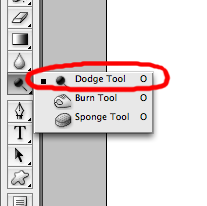
After we created our background, we used the circle cut out tool to cut out a section of our photgraph in a circular shape to place in the centre of the eye. We then put the layer with the photograph of the girls over the top of the layer with the eye, we then changed the opacity of the photograph so you could still see the iris of the eye through it. We did this to symbolise the girls were being watched and to create curiosity. After making sure both the image were in the right place we used the eraser and dodge tool to smoothe out the edges.

When the background and the main image was done, we added on some text where we thought it should be placed to get a rough idea of how our final product would look.

Finally we added on the font we wanted to use, which was Bison and changed it to red using the paint bucket tool to fill the text. 
We changed it to red so that it would match all our othe media products as they are a promotion pack therefore we stuck to our colour scheme to convey this. We also added credits at the bottom using the text tool.
The credits included all of the casts real names, the directors and the people who were encharge of the mis-en scene. We tryed to make it as believable as possible and as close as professional as we could.
No comments:
Post a Comment